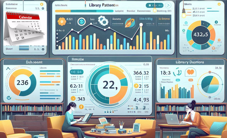
Transform Patron Data into Actionable Insights
Patron Data Visualization Dashboard

Empower Your Library Through Data Visualization
Generate daily, weekly, monthly, quarterly, and annual reports to spot emerging patterns and optimize services:
- Date range, days of week, and time of day pickers
- User segment filters
- Clickable elements to drill into raw data
- Consistent scales across related charts to simplify comparison
- Annotated significant spikes, dips, or anomalies
- Automated report scheduling (daily, weekly, monthly, and yearly)
- Secure role-based access for staff and administrators
- Cloud-based platform with 24/7 uptime and data backups
- User-friendly interface requires no coding
Patron Data Visualizations of Key Performance Indicators
| KPI |
Definition |
| Total Computer Sessions |
Count of all login sessions on public computers |
| Average Session Duration |
Mean length of user sessions (minutes) |
| Peak Usage Hour |
Hour of day with highest number of concurrent sessions |
| Computer Utilization Rate |
% of in-use stations vs. total available |
| Average Wait Time |
Mean wait time before a computer becomes available |
| Unique vs. Repeat Users |
Ratio of first-time to returning users |
| Print Jobs per Session |
Average number of pages or jobs initiated per computer session |
| Wi-Fi Connections |
Count of unique device connections to library Wi-Fi |
| Patron Satisfaction Score |
Survey-based satisfaction rating for computer facilities |
- Seamless integration with your patron data
- Automated report scheduling
- Export to Excel, HTML, CSV, or PDF
- Secure role-based access for staff and administrators
- Cloud-based platform with 24/7 uptime and data backups
- User-friendly interface that requires no coding
Create Predictive Analytics
- Reduce wait times
- Monitor total sessions
- Reduce peak-time congestion
- Evaluate program attendance
- Optimize staffing
- Forecast future demand
- Optimize computer allocation
- Maximize Wi-Fi connection traffic
- Forecast demand spikes
Patron Time Series Visualization Charts
Line and area charts track usage trends over days, weeks, months, or years:
- Line charts show total sessions over time
- Moving averages and trend lines highlight growth or decline
- Line charts track daily or hourly trends (e.g., computer sessions, foot traffic)
- Area charts emphasize cumulative growth or decline over time
- Spot seasonal dips, growth spurts
- Monitor the effects of promotions and policy changes
Data Visualization of Patron Journey Flow
Visual Floorplan Map shows how library visitors move through services:
- From login to different software categories, printing, and Wi-Fi
- Seamless integration with your ILS
- Automated report scheduling (daily, weekly, monthly, and yealy)
- Export to Excel, HTML, CSV, or PDF
- Secure role-based access for staff and administrators
- Cloud-based platform with 24/7 uptime and data backups
- User-friendly interface that requires no coding
Real-Time Animated Data Visualization
Animating your charts can bring time-series and flow data to life,
guiding the eye through changes over time or process steps, making complex
dynamics, like daily peaks in computer usage, become immediately clear.
- Grasp trends and transitions at a glance
- Play/Pause/Slider controls enable users to explore at their own pace
- Real-Time and automated hourly report updates
- Secure role-based access for staff and administrators
- Cloud-based platform with 24/7 uptime and data backups
- User-friendly interface that requires no coding
Ready to Transform Your Library?
See It in Action
Watch how easy it is to slice and dice your library’s data for deeper insights.
FREE 30-day Trial Evaluation


